
Three visitors land on your landing page at the same instant. By the time the page finishes loading, they are already on three different planets.
The price-sensitive buyer is hunting for a dollar sign. They have not read your headline yet. They are using their eyes the way a hawk uses them, which is to say, badly for prose. The technical evaluator is scanning for one specific technical word that proves you exist as a real product. The skeptical researcher is looking for someone other than you saying you are not a scam. Same eight seconds, same pixels, three completely different pages. You built one. They left three.
Most landing page advice still treats visitors as a single group with averaged preferences. Optimise the headline. Add social proof. Make the CTA prominent. None of this is wrong. It is just incomplete in the same way that telling six people in different countries the weather is "fine" is incomplete. They are not standing where you are standing.
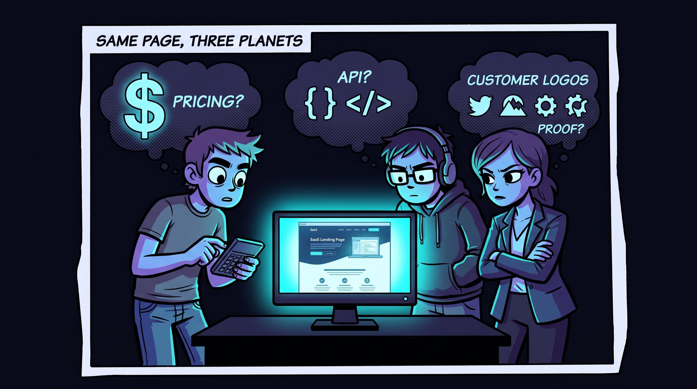
Same page. Three different planets. The version you optimised for one visitor type is invisible to the other two.
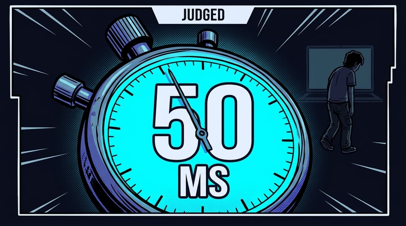
50 Milliseconds, 2.6 Seconds, 10 Seconds. None of Them Are 8.
It is not. It is also not eight seconds.
The "humans have shorter attention spans than goldfish" claim traces back to Statistic Brain, a marketing company that, when the BBC investigated, could not produce a primary source. The goldfish comparison is fabricated. No peer-reviewed paper supports the number. Gloria Mark at UC Irvine, who actually measures this for a living, clocked the real number at about 47 seconds per screen before task-switching, down from 2.5 minutes in 2003. Attention is not collapsing. It is becoming more selective. Different problem.
The validated research underneath the myth is more interesting. Lindgaard et al. (2006), one of the most cited usability papers ever written, found that aesthetic judgments form in 50 milliseconds and remain stable at longer exposures. Read that again. Fifty milliseconds. That is one-twentieth of a second. Faster than the eye can blink. A 2012 Google and University of Basel study (Tuch et al.) detected design preference effects at 17 milliseconds. The page's vibe is locked in before any single word has been read. There is no version of "above-the-fold copywriting" that wins this round. The visual already lost or won by the time the visitor's brain has finished noticing the page exists.
Aesthetic judgment is not comprehension. The visual impression is instant. Understanding takes longer. Missouri S&T's 2012 eye-tracking work found that visitors' eyes land on the area that most influences first impression within 2.6 seconds. Nielsen Norman Group, in a Weibull survival analysis of 2 billion page visits, identified a 10-second decision window: the probability of leaving is highest in the first 10 seconds, then drops sharply for those who stay.
So the real window is not 8 seconds. It is layered: 50 milliseconds for the vibe, 2.6 seconds for the eye to find the most influential element on the page, 10 seconds for the stay-or-leave decision. Most landing page optimisation is fighting for the 10-second window and pretending the 50-millisecond one does not exist. Both matter. They are measuring different things.
50ms
Time to form an aesthetic judgment of a page. Stable at 500ms and 10 seconds. Lindgaard et al., Behaviour & Information Technology, 2006
Key takeaway
The 8-second attention span is a myth. The validated window is layered: 50ms for aesthetic judgment, 2.6s for eye-landing on the key element, 10s for the stay-or-leave decision. All three are happening on your page right now.
What 50 Simulated Visitors Saw on the Same Landing Page
We did not interview 50 people. We ran 50 distinct visitor profiles through the same page, each with a different cognitive load-out.
Each persona in a WhyIQ simulation carries a defined set of parameters: primary goal, skepticism level, technical knowledge, device context, familiarity with the product category, and tolerance for ambiguity. A price-sensitive buyer arrives asking one question: what does this cost. A technical evaluator arrives asking another: how does this actually work. A skeptical researcher arrives asking a third: who else uses this, and what did they say about it on the way out.
For each persona, the simulation reports what they noticed first, what confused them, whether they understood the value proposition, what was missing for them specifically, and whether they continued scrolling or left. That produces 50 independent readings of the same page, each filtered through a different priority stack. The interesting finding is not that some personas bounce and others stay. The interesting finding is that they bounce for completely different reasons, and each reason maps to a specific, fixable element on the page.
This matters because the founder, watching their own page, is looking at it through one set of priorities. They cannot help it. The pricing question is answered for them already, the technical mechanism is so obvious they forgot to write it down, and they already trust themselves. They are objectively the worst person in the world to QA their own page.
What Different Visitor Types Look at First on a Landing Page
NNG's eye-tracking research found that scanning is "ruthlessly focused on the current task and ignores content unrelated to the user's goal." Different tasks produce fundamentally different scan paths on the exact same page.
| Visitor Type | Primary Focus (First 8s) | Leaves If Missing |
|---|---|---|
| Price-sensitive buyer | "$" signal, pricing link, plan comparison | Any cost indicator in the first two scrolls |
| Technical evaluator | Specificity. Integration names, APIs, architecture | One concrete technical detail in headline or subhead |
| Skeptical researcher | Logos, named testimonials, external validation | Any proof from someone other than the company |
| Impulse-action visitor | Clear CTA, speed signals ("30 seconds", "free", "instant") | Obvious next step visible on first screen |
| Comparison shopper | Differentiators, "vs" language, unique angle | Anything that separates this from alternatives |
| Problem-aware beginner | Plain language, problem statement, absence of jargon | Recognition of their problem in the first sentence |
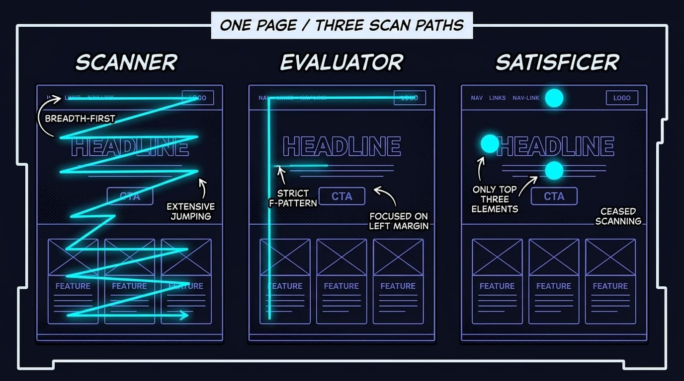
Academic research on motivation-dependent browsing identifies three scanning strategies that visitors use depending on goal: breadth-first scanners who jump between sections looking for relevance cues, depth-first evaluators who read sequentially from the top, and satisficers who check the top three elements and decide. The strategy a visitor uses depends on their goal, not your page's design. You cannot pick which strategy they use. You can only ensure the page provides what each strategy is looking for, in the place that strategy will look.
2.6s
Time for the eyes to land on the area that most influences first impression. Missouri S&T Eye-Tracking Research, 2012
79% Scan. 16% Read. The First 550 Pixels Decide the Other 100%.
Across all 50 persona types in our simulations, three elements consistently determine whether visitors continue or leave. None of them are headline word counts.
1. Headline clarity. Can the visitor name the product category in two seconds?
Not what the product does in painful detail. Whether the visitor can place it in a mental category within two seconds. "Landing page conversion diagnostics" is a category. "Accelerate your growth journey" is a corporate mood, not a category. The headline does not need to sell. It needs to orient. A visitor who knows the category will decide whether to stay based on the subheadline and proof. A visitor who cannot identify the category leaves before either of those gets a chance to argue.
The honest test: cover your headline. Show your subheadline to a stranger. Can they name what your product does? If not, the headline is doing decoration work, not orientation work.
2. Specificity. Is there one concrete detail?
A number. A named feature. A use case. A timeframe. "50 visitor personas in 30 seconds" is specific. "Powerful insights for your business" is the kind of phrase that gets printed on a tote bag at a conference. Specificity signals that there is a real product behind the page, not a Notion template with a domain. In our simulation data, pages with at least one specific detail in the first screen had measurably higher engagement across every persona type. The detail itself matters less than its existence. Specificity is a proxy for credibility.
3. Visual trust. Does this look like a real product, or a placeholder?
46.1% of users judge website credibility primarily on visual design (Stanford Web Credibility Research, Fogg, 2002). This is the 50-millisecond judgment. Before words are processed, the visual impression has already been formed. Stock imagery, template layouts, generic gradients in two shades of purple, the same hero illustration of three blob characters around a screen, all of it signals "not a real product yet." Custom screenshots, specific UI elements, a colour system with a point of view all signal "someone built this and it works." The visual trust check happens before content is processed. Fail it and the content never gets a turn.
46.1%
of users judge website credibility primarily on visual design. Stanford Web Credibility Research, Fogg, 2002
5 Above-the-Fold Mistakes Almost Every Landing Page Makes
Chartbeat's data on actual viewer behaviour shows the most-viewed zone is roughly 550 pixels from the top, with 80%+ viewership. What you put in that zone determines everything else.
The most common above-fold failures we see in production simulations, ranked by frequency:
Vague headlines. "The future of [thing]." "Reimagine your [workflow]." "Your all-in-one [platform]." These do not orient. They decorate. The visitor still does not know what the product does. Both of you can feel the failure but only one of you is going to leave.
A subheadline that adds no new information. The subheadline is the second chance. If the headline is broad, the subheadline must be narrow. Most pages make both broad and call it "consistent voice."
A CTA that uses product jargon. "Start your workspace" assumes the visitor already understands your product model. They arrived 3 seconds ago. They do not know that "workspace" is your noun for the thing.
Stock or template imagery. Hero illustrations that could belong to any product signal "this is not real yet." Product screenshots, even ugly ones, signal "this exists and it works."
No social proof visible on load. Trust signals below the fold reach 76 to 91% of visitors (most people scroll). They reach 0% of the visitors who leave in the first 10 seconds. Those visitors are also disproportionately your highest-intent skeptics, because they are the ones doing the most due diligence at the start.
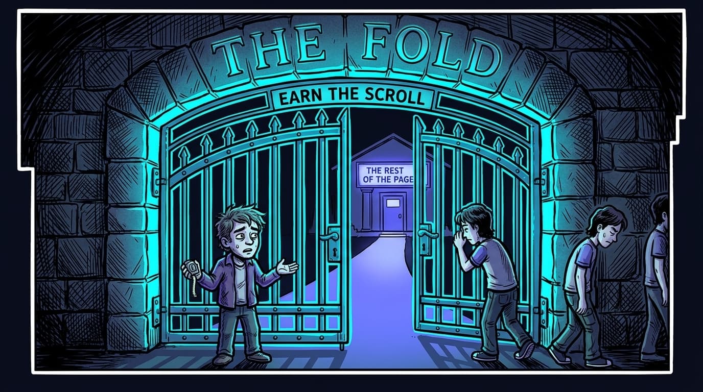
The good news: 76 to 91% of users do scroll past the fold. The "nobody scrolls" claim was already dead by 2018 and is now mummified. The fold still matters not because it is a wall, but because it is a gate. The first screen does not close the deal. It earns the right to keep talking.
One Page That Holds for All 50 Visitors. Here's the 3-Move Pattern.
You cannot build six different landing pages for six different visitor types. You can ensure the first screen does not completely fail any of them.
For the price-sensitive buyer
Include one pricing signal above the fold. Not the full pricing table. A single indicator: "Free scan," "Plans from $19/mo," "No credit card required." It does not need to dominate the page. It needs to exist. The price-sensitive buyer is scanning for one signal. If they find it, they continue. If they do not, they leave and check a competitor that shows pricing upfront, which, statistically, is most of them now.
For the technical evaluator
Name one specific mechanism. Not "AI-powered." "Simulates 50 visitor personas using behavioural psychology models." Specificity is what technical evaluators use to distinguish real products from vaporware that bought a domain on the weekend. One specific detail in the subheadline or first paragraph earns them enough trust to scroll to the technical details below.
For the skeptical researcher
Place one piece of third-party proof within the first 400 pixels. A recognisable logo. A named customer with a specific result. A publication mention. The skeptical researcher is not reading your copy to evaluate the product. They are scanning for signals that someone other than you vouches for it. One proof element keeps them on the page long enough to find the rest.
For the impulse-action visitor
Make the CTA visible on load with a clear, specific outcome. "Run a free scan of your page, results in 30 seconds." This visitor does not want to read. They want to act. If the action is clear and the commitment is low, they take it. If the CTA says "Get Started" with no specificity, they have no reason to click. They do not know what they get.
Key takeaway
One headline that orients. One specific detail that proves depth. One trust signal from outside. One clear action with a stated outcome. Four elements serving four visitor types. The page that does all four does not feel cluttered. It feels clear.
The common thread across all four: the fix is not more content above the fold. It is the right content. One headline that orients. One specific detail that proves depth. One trust signal from outside. One clear action with a stated outcome. Four elements serving four visitor types. The page that does all four does not feel cluttered. It feels clear.
Most founders cannot see which of these their page is missing because they fill in the gaps with their own knowledge. They know the price. They know the mechanism. They trust themselves. The only way to find out which planet your visitors are actually on is to simulate every planet on the same page at the same time.
WhyIQ simulates 50 distinct visitor types on your page in about 15 minutes, scoring it on the elements that decide the first 8 seconds: headline clarity, specificity, visual trust, and the proof signal each visitor type is scanning for. No traffic required.
Scan your landing page freeFrequently Asked Questions
How long do visitors spend on a landing page?
The critical decision happens in the first 10 seconds. Nielsen Norman Group's Weibull survival analysis of 2 billion page visits found the probability of leaving is highest in the first 10 seconds, then drops sharply for those who stay. Visual appeal is judged even faster: Lindgaard et al. (2006) found aesthetic judgments form in 50 milliseconds and remain stable at longer exposures. Most landing pages have less than 10 seconds to communicate their core value.
What should be above the fold on a landing page?
Three elements consistently determine whether visitors continue past the first screen: headline clarity (can the visitor name the product category in two seconds), specificity (at least one concrete detail like a number, a named feature, or a timeframe), and visual trust (does the page look like a real product, not a template). Chartbeat data shows the most-viewed zone is approximately 550 pixels from the top, with 80%+ viewership. Content in that zone needs to answer: what is this, who is it for, and why should I care.
How do different visitors read the same page?
Research identifies three primary browsing strategies. Breadth-first scanners jump between sections looking for relevance signals. Depth-first evaluators read sequentially from top to bottom. Satisficers check the top three elements and decide. Different motivations produce different scan paths on the exact same page. A price-sensitive buyer scans for cost signals. A technical evaluator scans for specificity and integration names. A skeptical researcher scans for third-party validation. One page, three completely different experiences, every time.
What do first-time visitors look at first on a landing page?
Eye-tracking from Missouri S&T (2012) found that visitors' eyes land on the area that most influences first impression within 2.6 seconds. On text-heavy pages this follows an F-pattern: horizontal scan across the top, shorter horizontal scan partway down, vertical scan along the left margin. On visual landing pages it shifts to a Z-pattern. The key NNG finding underneath both: scanning is ruthlessly focused on the current task. Visitors do not passively absorb. They hunt for goal-relevant information.
How do you optimise above-the-fold content for conversions?
Do not try to say everything above the fold. The goal is not to convert above the fold. The goal is to earn the scroll. Place one clear claim (what this does, specifically), one trust signal (a name, a number, a logo), one low-commitment CTA (what the visitor gets, not what you want from them). 76 to 91% of users scroll past the fold, so the fold is not a wall. It is a gate. The question is whether the first screen gives visitors a reason to walk through it.
Do visitors read landing pages or just scan them?
79% scan, 16% read word-by-word (Nielsen Norman Group). On the average web page, users read at most 20 to 28% of the text. The implication: pages are not consumed as prose. They are scanned for signals. Headlines, bold text, numbers, and visual contrast are what get processed. Body paragraphs are skipped unless a scanning signal pulls the reader in. Structure for scanners first. Readers are also served because scannable structure improves comprehension for everyone.
Is the 8-second attention span real?
No. The claim traces to Statistic Brain, a marketing company that could not produce a primary source when the BBC investigated. The goldfish comparison is fabricated. No peer-reviewed research supports it. Gloria Mark at UC Irvine measured 47 seconds per screen before task-switching, down from 2.5 minutes in 2003. Attention is becoming more selective, not collapsing. The validated version of the idea is NNG's 10-second decision window: if a page has not communicated its value by second 10, the visitor is mentally leaving.
Why do some visitors bounce in the first 3 seconds?
Visitors bounce in the first 3 seconds when the page fails the 50-millisecond aesthetic judgment, when the headline does not give them a product category they recognise, or when there is no signal for the specific thing their visit goal asked. Different visitor types bounce for different reasons in the same 3 seconds. A skeptical researcher bounces on the absence of third-party logos. A price-sensitive buyer bounces on the absence of any cost signal. A technical evaluator bounces on a headline that sounds like marketing rather than a product description.