
Most of your visitors are not saying no. They are saying "I have no idea what this is," and then they are gone.
The average landing page converts around 2 to 3 percent (WordStream), which is a polite way of saying 97 out of every 100 people you fought to get turn around at the door and walk back out. Here is the genuinely good news: you can fix most of that without buying a single extra click. Take a page from 2 percent to 4 and you have doubled your sales on the exact same traffic. No bigger ad budget. No six-month SEO wait. No luck. That is the entire job of conversion rate optimization (CRO): find the friction sitting between a visitor and a yes, and rip it out.
I have watched 50 simulated visitors bounce off one page for ten different reasons, so I will skip the warm-up and tell you which fixes actually move the number. Ten of them, ranked from "do this first" to "do this when you are serious." The first few are where most pages live or die. The last two are about finding what is broken instead of guessing at it. Every number is sourced.
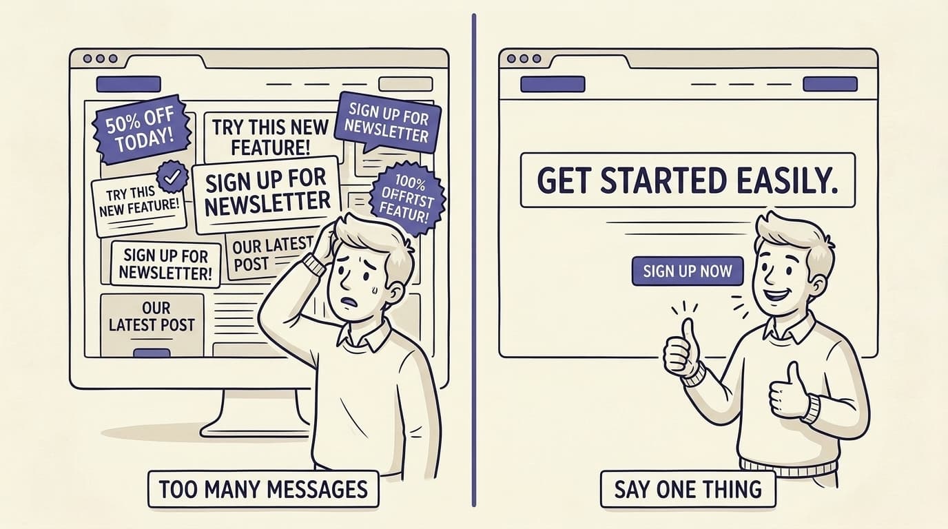
Say One Thing, Clearly
Forget the button color. The single biggest lever on your whole page is whether a stranger can tell what you do, who it is for, and why it beats the alternative, in about five seconds.
Most pages faceplant right here by trying to say five things at once, which means they say nothing. Clarity beats traffic, and it is not a close fight. Across five pages we studied, fixing the message alone, no redesign, not one extra visitor, lifted conversions by 79 to 225 percent. So before you touch anything else: pick the one thing your visitor actually came for, say it in plain words above the fold, and cut everything that competes with it for attention. Every sentence that does not pull someone toward your one action is decoration, and decoration is expensive. More on why clarity, not traffic, is usually the real problem.
79% to 225%
conversion lift from fixing the message alone, across five pages, with no extra traffic. WhyIQ case studies
Key takeaway
If a visitor cannot tell what you do and why it is for them in five seconds, nothing else on the page gets a chance to work.
Win the First 8 Seconds
Your visitor has judged you before they have read a word.
People form a first impression of a web page in about 50 milliseconds (Lindgaard et al., 2006), faster than you can blink, and that gut reaction colors everything that comes after. You do not get a do-over on the top of the page. So the part of the screen that loads before anyone scrolls has to do the whole job: a headline that lands, a one-line explanation, one obvious next step, and an image that backs up the message instead of just sitting there looking nice. Everything below the fold is a reward for the people you have already hooked. If your first screen is vague or busy, most visitors are gone before they ever reach the brilliant argument you buried in section four. Here is what 50 visitors actually saw in the first 8 seconds.
50ms
is all it takes for a visitor to form a first impression of your page, faster than conscious thought. Lindgaard et al., Behaviour & Information Technology, 2006
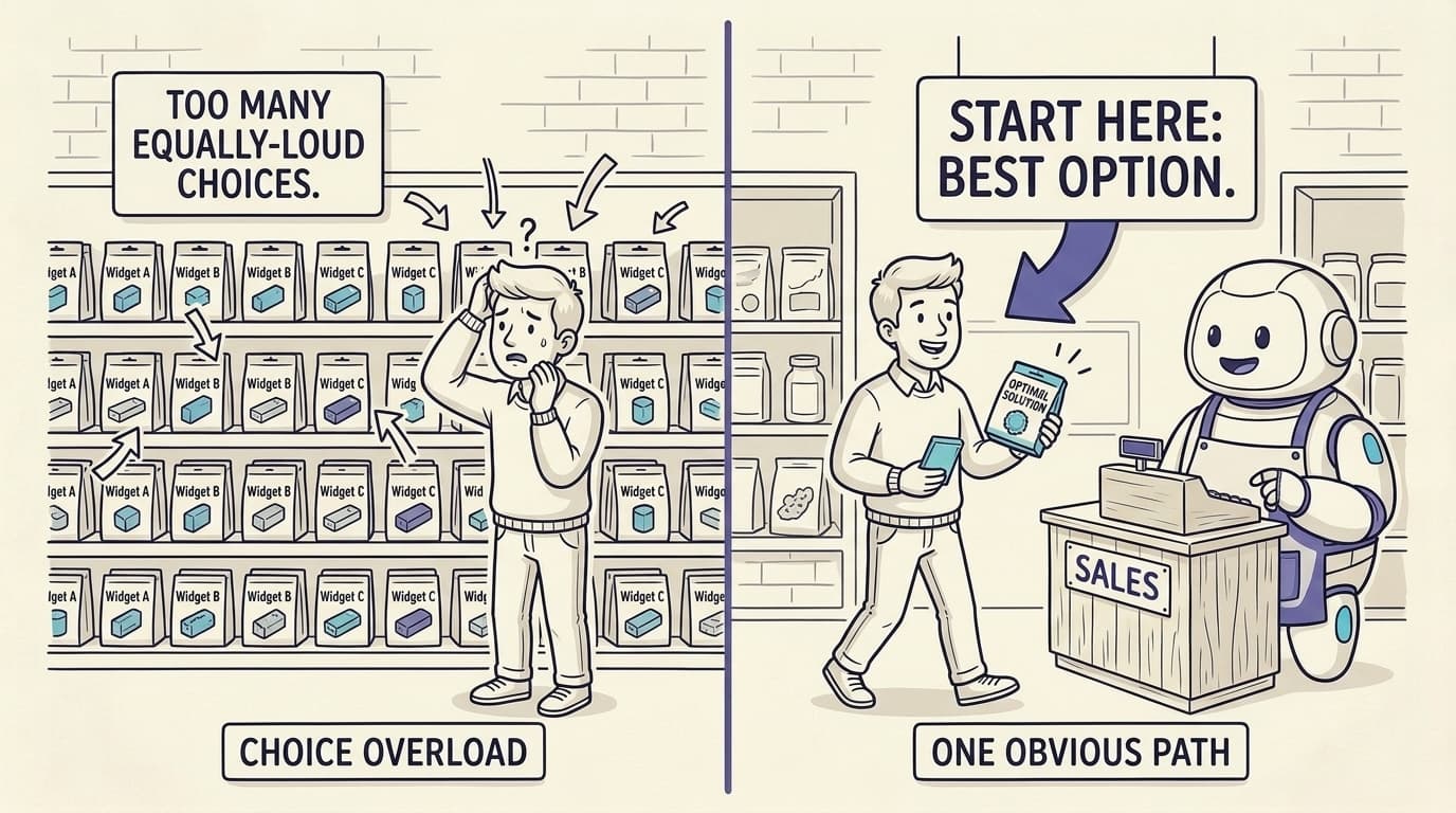
Give One Obvious Primary CTA
More options feel generous. They also tank your conversion rate.
In the famous jam study, a table with 24 jars pulled a bigger crowd than a table with 6, but the small table outsold it roughly ten to one: about 30 percent of tasters bought when there were 6 choices, versus 3 percent when there were 24 (Iyengar and Lepper, 2000). Every equal-weight option you stack in front of someone splits their attention and freezes the decision. On a page, that means one primary call to action, repeated, with everything else clearly turned down. Not six buttons shouting at the same volume. Not a nav bar wrestling your signup for the click. Decide the single most valuable thing a visitor can do, make it the loudest thing on the screen, and demote the rest. A confused visitor does not pick the safe option. They pick nothing, and then they leave.
~10x
more purchases from 6 options than 24 (about 30% versus 3% of shoppers bought). Iyengar and Lepper, 2000
Match the Message to the Click
Every visitor lands with an expectation already in their head, set by the ad, the search result, or the link they just clicked. Confirm it in the first second, or lose them.
If your page does not match what brought them, you have snapped the thread and they are gone. An ad that promised "free invoicing software" should hit a page whose headline says free invoicing software, not a clever three-word brand slogan that means nothing to a stranger. Unbounce has a name for the related sin: attention ratio, the number of things a visitor can do on a page versus the one thing you want them to do. A focused landing page keeps that close to one to one. One link, one goal. Send your paid and campaign traffic to a dedicated page that echoes the exact promise that earned the click, not your everything-bagel homepage. It is one of the cheapest wins on this list, because you change nothing about the offer, only how fast the visitor sees that it is for them.
Make Trust Visible Early
Nobody hands over money or an email to a brand they do not trust, and trust is built with specifics, not adjectives.
Real reviews, named testimonials, logos people recognize, a security badge, a plain-English guarantee. All of it beats another round of "world-class" copy. Products that show reviews can convert up to 270 percent better than the same products with none (Spiegel Research Center, 2017). The classic mistake is stashing your proof at the bottom of the page, politely, after you have already asked for the sale. Move it up next to the decision: beside the CTA, beside the price, beside the form, exactly where the doubt lives. And keep it concrete. "Trusted by 4,000 teams" with the logos to back it crushes "trusted by industry leaders." A number a visitor can picture beats a superlative they will roll their eyes at.
up to 270%
better conversion for products that show reviews versus those with none. Spiegel Research Center, Northwestern, 2017
Key takeaway
Put the proof where the doubt is. Trust signals belong next to the price and the button, not buried in the footer.
Cut Form Friction
Every field on your form is one more small reason to give up.
The average online checkout asks for around 11.8 form fields, roughly double what it actually needs, and 22 percent of shoppers walk away from a purchase specifically because the process felt too long or too complicated (Baymard Institute). So go through your forms like you are paying for each field, because in lost conversions you are. Do you really need a phone number to email someone a guide? A company size before they have even tried the thing? Cut every field that is not load-bearing for the next step and ask for the rest later, once they are in. For the fields you keep, lower the effort: validate inline, explain why you need anything sensitive, and never make someone guess what they did wrong after they hit submit. A shorter, clearer form keeps more of the people who were already willing to fill it in.
Lead With the Benefit, Not the Feature
Nobody buys a feature. They buy the better version of their day the feature gets them.
"Two-way calendar sync" is a feature. "Never double-book a client again" is the reason somebody actually signs up. Lead with the outcome, then let the feature explain how you pull it off. And this matters more than how pretty the page is. When Unbounce dug through 36,928 landing pages, copy drove the majority of conversion performance, well ahead of visual design. A gorgeous page with feature-list copy loses to a plain one that names the outcome the visitor wants. Write every headline from their side of the table: what they get, what changes, what problem just disappeared. Then delete the sentences that are secretly about you. It is also why copy, not design, decides most conversions.
65% to 70%
of landing-page conversion performance traces to copy, not design, across 36,928 pages. Unbounce
Reduce Cognitive Load
Every decision you ask a visitor to make is a tiny tax, and the bill comes due as people leaving.
Hick's Law puts it plainly: the time it takes to choose grows with the number and complexity of the choices on offer. A page stuffed with options, jargon, and visuals all fighting for the eye forces the visitor to work, and a working visitor is a leaving visitor. Make the page easy. Use words a twelve-year-old would follow. Break the text into short, scannable chunks. Give the eye one clean path from headline to proof to action. Strip anything decorative that does not help someone understand or decide, because every extra animation, stray stat, and bonus link is another line on the tax bill. This is not minimalism for the look of it. It is making the single most important thing also the easiest thing to see and do.
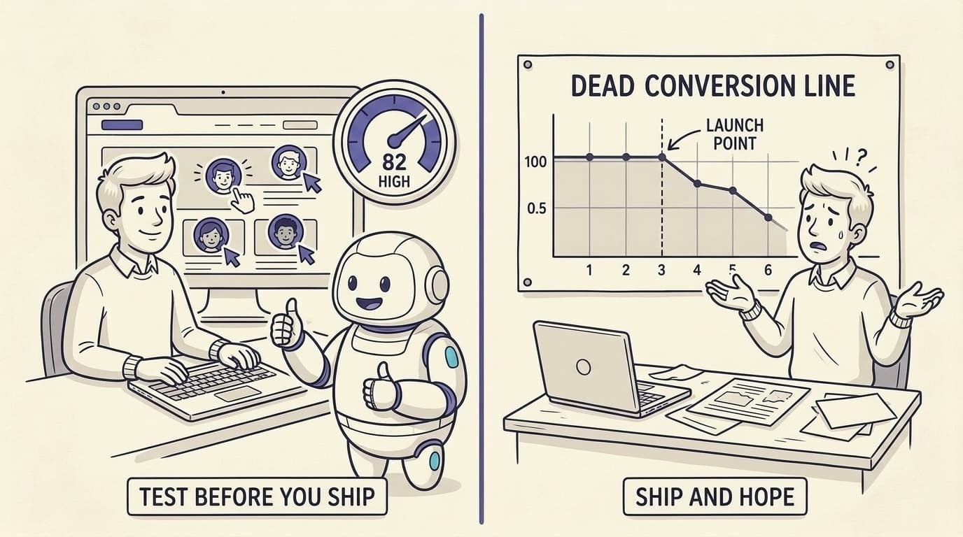
Test Before You Ship, Don't Guess
Most teams "optimize" by shipping a guess and waiting to see what the internet thinks. The waiting takes forever and the guess is usually wrong.
At 1,000 visitors a month, a single A/B test can take around 28 months to reach statistical significance, and only 14 to 20 percent of audit-driven A/B tests ever get there at all. Shipping and hoping is not a strategy, it is a prayer with a dashboard, and praying is a hell of a way to run a funnel. The real move is to find the problems before you spend traffic on them. Pressure-test the page against how actual visitors will read it, fix the obvious friction first, and save live A/B testing for the genuinely close calls you have the volume to settle. Guessing is so expensive precisely because the feedback loop is so slow. This is also why most CRO audits never move the number, and what a pre-traffic CRO tool is for.
14% to 20%
of audit-driven A/B tests reach significance, and at 1,000 visitors a month one test can take 28 months. WhyIQ analysis
Key takeaway
Diagnosis is cheaper than guessing. Find the friction before you spend traffic on it, and save A/B testing for the close calls.
Diagnose Why Visitors Leave, Not Just What They Do
Analytics and heatmaps are great at what. They are completely silent on the one question that changes your conversion rate, which is why.
A heatmap is a security camera: it proves someone was in the building and then walked out. It has no clue the plan names made no sense, or the price felt like a stretch, or the one reassurance they needed was nowhere on the page. Closing that gap means seeing your page the way different people see it, the skeptic, the bargain hunter, the technical buyer who needs one specific word, and surfacing the exact reason each of them bails. Once you know the why, the fix stops being a guess. That is the whole point of WhyIQ: it simulates how distinct visitor types actually experience your page and tells you, in their own words, what confused them and what made them leave, before you have spent a dollar sending traffic at it. If you are still not sure why your page is not converting, start there.
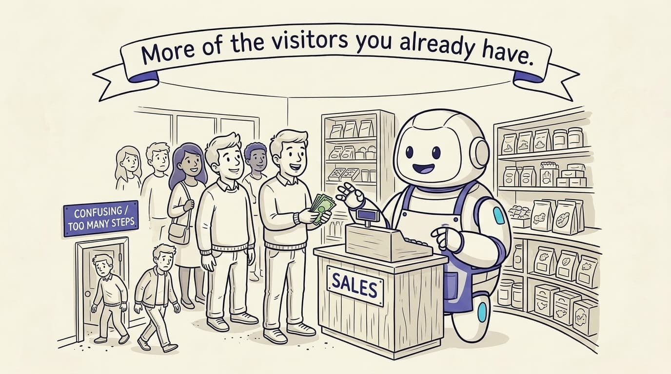
You do not need more visitors. You need more of the visitors you already have to say yes.
Frequently asked questions
What is a good conversion rate?
The average landing page converts around 2 to 3 percent (WordStream), with the top quartile near 5 percent and the best pages above 10. A good rate depends on your industry, price point, and traffic source, so the number that matters most is whether you are beating your own previous baseline.
How do I improve my conversion rate without more traffic?
That is exactly what CRO is for. You work on the visitors you already have: clarify the message, cut friction, and make trust visible. Lifting a page from 2 to 4 percent doubles your sales at the same traffic, which is why clarity usually beats buying more clicks.
What is the fastest way to lift conversions?
Usually clarity plus one obvious call to action above the fold. They are the cheapest high-impact changes and need no extra traffic to validate. After that, surfacing trust early and cutting form fields tend to give the next-largest gains for the least effort.
Is CRO the same as A/B testing?
No. A/B testing is one CRO method, and it needs traffic and time. CRO also includes diagnosis, clarity and copy fixes, and pre-traffic testing. At low traffic, A/B testing alone is too slow to rely on, so a diagnosis-first approach usually wins.
How long does CRO take to show results?
Clarity, copy, and CTA fixes can show within weeks. A/B-validated changes take longer: a single test at 1,000 visitors a month can take roughly 28 months to reach significance. That slow loop is why finding problems by diagnosis beats testing everything.
Do I need a lot of traffic to do CRO?
No. Diagnostic and pre-traffic methods work before you have meaningful traffic. A/B testing needs volume, but behavioral simulation and a careful read of how visitors experience your page do not, which is what makes them useful for new or low-traffic sites.
What tools help improve conversion rate?
Analytics like GA4 and heatmaps like Hotjar tell you what visitors do. Behavioral simulation tells you why they leave. WhyIQ simulates how distinct visitor types read your page and returns the specific reasons each one would bounce, before you spend on traffic.
Read next
If conversions are flat, start by ruling out the usual suspect in you don't have a traffic problem, then work through the 9 reasons a landing page doesn't convert. For why most audits miss, see CRO audits are broken.